Thursday 29 January 2015

Repeat Pattern, Set 2.

As more evidence towards CAD (Computer Aided Design). I created another batch of computerized pattern work for documentation. 

 So for this batch i used the same techniques as the first batch i made. All images were done on photoshop and then the colours changed on photoshop colour scales.
The only different thing with these images when compared to the first set i did is that; this is from another image taken from my observational drawing and they are only monochromatic images instead of colour harmonious. There isn`t really much of an explanation to go along with these photoshopped images. These images and patterns are so easy to produce and put together, you can do them by hand after you`ve printed them out; use a light box and trace over the top of the image and mirror repeat it like you`ve done on the computer. I`ve actually some A2 sized pattern repeats, but the majority of them aren`t finished right now, so i`ll share them with you another time.


Along with these few images i`ve put together, with a rather subtle monochromatic tone, i made some that are a lot darker in tone when compared with these. 


All of these images; once again, have been constructed on photoshop and have simply had the colour scale changed to change the tones of them. Messing around and changing the tones of an image can be one of the most important things in a surface pattern piece. Using the correct mixture of tones and harmonies, you can create an interesting piece of work. 


~Thanks For reading! 


Wednesday 21 January 2015

Fineliner Drawings.

As part of experimentation with materials i decided to go off in my spare time and create some fineliner images. Only using fineliners to create an image was difficult, since you can`t rub out the ink and you can`t really use any other colours on the image, it`s hard to get the correct effect for the image. 


For my fineliner drawings i took parts of images from my observational drawings; however, one of my drawings has been completed and the other one hasn`t, so it was slightly awkward when choosing the areas to work fro as i had to finish off the image and rush it... Which in some perspectives, makes my work look messy and un-organized. 

I decided to experiment with the fineliners as if you write or doodle with them, you can clearly see that it`s a lot easier to shade with them than pencils. Well that`s my opinion; i find that it`s easier to create darker shades than lighter shades. Obviously, it`s just black ink; but the dark tones can draw the life and energy out of an image, it can almost make an image look dark and depressing. 

since i`ve chosen quite a dark theme for my project, i thought that the experimentation would go well with some of my images. The teachers did love my creativity with something new that no one in my class had done before. No one else has actually done them still, it seems like i`m the only one who did this kind of experimentation. 

I loved the way my work turned out though; The dark tones fit the depressing mood of my chosen project, i guess it`s what my work needed to push it along and gain a higher grade within my project. For improving my grade i think i should add bonus mark making to the darkest areas of the objects of the composition, this should add some textual detail to the objects. The only downside is that when you use fineliners you can`t add highlights to the tones, so it can come across as very bland. 


The only negative thing about trying out the fineliner technique is that the pieces take a while to finish, a lot of time and patience is needed to add the tonal detail needed to create a good piece. 

Altogether the pieces took over 18 hours to complete, the small four pieces at the top of the page are only A3 size and this main one is an A1 size piece. I`ve also gone through an un-believable amount of fineliners, they run out so quickly that it extends the amount of time taken to finish the pieces. 


They really do look great once finished and they can add a dark and somber mood to any project; I don`t think i would use the technique for anything more lightning and happier... I would say that using fineliners for large pieces of work like this should just be for darker projects/subjects.

~Thanks For Reading! 

Practice Paintings.

Since i started at Sixth form, my main focus has been getting better and gaining more painting techniques as the majority of my paintings end up looking like giant colourful blobs that just sit and stare at you in the face. 

One of the best things about being in Sixth form is that you get to have every art teacher in the school, which also means that they all specialise in one subject. So when in lessons you are being taught only one thing that they are specialising in. Which also means that if you have one lesson, that`s an hour of learning different techniques and an hour of working on something new! Which means that you have that full hour before the next teacher comes in, to work on the new techniques learned and you get to compare them to other students techniques.

This canvas was actually designed by my boyfriend, then i painted the piece once the design was complete.
The main flowers colour is done with monochromatic red. Monochromatic just means that you begin with red and the shade of the red changes over and over again. the centre of the flower is a dark purple and the stem of the flower is dark green.
First of all, i used acrylic paints on the canvas, and i didn`t lay down a medium on the canvas before i started. to put the paint on i used a normal brush, whilst the paint is still wet i scumbled a lighter shade next to it so it blended together. Scumbling is a simple process, but it`s the choice of brush that will effect the outcome of the application.
scumbling brushes are mostly rather stiff, they handle of the brush will be like any other; but it`s the brush itself. The brush should be hard and quite thick, it should be uneven and quite brittle to touch; there should also be not to many on the brush... It`s hard to explain what the brush looks like, but if you have a few brushes in your set that aren`t as smooth and even as they other brushes; if you`ve bought a complete set then the scumbling brushes should of come as a different colour to the other ones in the set.

scumbling has to be one of my favourite techniques when it comes to painting i like the fact that it isn`t as straight forward as you would think and that the scumbling technique does need experimenting with before it`s use. It can be quite messy aswell, seeing as brushes for scumbling an become un-neat and un-tidy when used often. Another problem is that only a thin layer of paint can be applied as a thick layer causes the brush to stick together and not separate; the separation of the brush is what causes a scumbling effect and it`s the most important thing with this technique.


 The good thing about using the scumbling technique is that you can add a range of tones to different materials on a canvas. This is the first small canvas that i did with added materials. On the dark brown areas i placed sand and small stones; before hand i added a base coat of paint and then i stuck the items down with PVA glue and paint on top of them. The skull in the top right corner is paint and PVA glue mixed together to make a thick paste. The purple flowers have an added texture of dried leaves that are mainly in the darkest areas of the painting.


Painting is something i defiantly need to be working on throughout my sixth form projects and hopefully i will get better at it and develop my own techniques when painting. The scumbling technique can be hard to do though a it`s just like scratching the paint onto the canvas` surface.
In the future, i think i`ll experiment with a wider range of colours and more materials that can be placed onto a canvas and then worked on top of. 

I do enjoy painting, but it takes time and patience to complete just a small canvas. It takes time and dedication to complete a fully painted canvas... That`s what i love about them!

~Thanks For Reading! 


Monday 19 January 2015

Repeat Patterns, Set 1.

As one of our workshops in Art, we have to practice and produce surface and repeat pattern work that ties in with out work. The easiest way to do this is to simply take a bit of your work and then edit it so you can produce something new. 


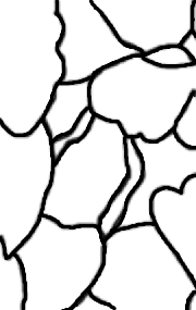
Producing my repeat pattern was really easy when you think about it just being a paper based outcome. There is a simple way to make patterns if you`ve already done some observational drawings or other work that involves a varied detailed range. The best way on deciding on a pattern is if you choose the most detailed part of the image, but make sure that the part chosen is only a small one. If the image is large and the area chosen is a large area; then shrink it down to the right size so you can begin working with it. Copy out the chosen image onto tracing paper or just trace straight over your chosen section if you think it`s the right size.

If you`re working from photoshop then you can either scan in the image of the chosen pattern area, or take a image of the pattern. By going on photoshop and creating a new layer, you can draw over the top of the image; then select it and create a new photoshop document so you can now flip it, rotate it, change it into a background pattern and just plain have fun with trying out new things with the pattern. 

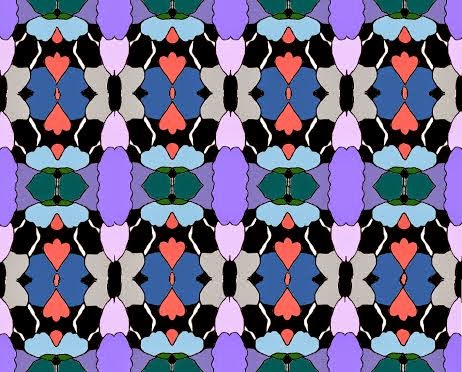
The image above/at the side, is the one that i`ve actually taken from my original observational drawing, i then shrunk the image down to the size i wanted and then i worked from it from there onwards. I prefer making mirror patterns that appear in blocks of bright colors; so that`s all i experimented with when it came to my repeat patterns. 


 All of the repeat pattern pieces you see here have been altered and adjusted on photoshop. You can add color very simply and easily with the sidebar tools.

If you find this hard to do then all of this can actually be done in paint... Yes, paint. It sounds weird, but think of all of the times when you were younger and you messed around on paint... Well mess around with it again and create something new. 


 Also, if you don`t actually have photoshop all of this can be done on other programs. There is also an online photoshop that you can use for free called Photogramio. If you don`t actually have photoshop and you`ve never used it then try this out; it`s much easier to use and can do a lot more interesting things to! 


t

Changing the colors are pretty easy aswell, but instead of choosing bright random colors i would suggest going for some color harmonies of different shades. An easy way to do it is just choose one color harmony, once you have one done you can change the color scale either on photoshop or photogramio ( like i recommended) I find it a lot easier to just use the photogramio 


For changing small things, like the color harmonies and colour effects, then here`s the link for Photogramio`s simple online editor:

For changing major things like you would usually do in Photoshop, here`s the link for the online version which is way easier to use and a lot quicker to use too:

By the way, i`m not actually sponsored by the site or anything like that; i just thought it would be nicer if you have an alternative to using photoshop which comes across as a lot harder to use for first timers and a lot more complicated then it should be. have fun messing around using Photogramio techniques and editing!

~Thanks For Reading! 

Friday 16 January 2015

Mixed Media.

Mixed Media pieces an be constructed out of any material you find, the are easy to do and the result can be completely different to the image you had started with. 

(I do apologize for you not being able to see the piece properly, it was on display at the time and i couldn`t get a better image as there were other 3D pieces that i didn`t want to knock over).

I absolutely love the outcome of a mix media piece. The only down side to them is the amount of time it takes to finish them; since you can use so many different materials, you can sometimes run out of time due to materials drying and fixing into place. Unfortunately, for my project I have only done one mixed media piece that i wasn`t too happy with. I have to admit, we were short for time due to workshops, but if i  had more time to finish the piece then i would of developed it further and added more materials to the surface of the piece. 


However; the base layer of the image needs to be something simplistic, like tissue paper or different colored paper. The you can add some shading by using inks, or, change the color completely with colored inks... Using these can also change the shade to a rather dark and somber tone. Then the layer afterwards needs to be something with a bit more bulk, something that adds a texture to the piece; for this second layer i used Hot wax, i used a few layers at the areas i wanted to be darker. In most pieces, people iron off the wax one it has fully dried; i left mine on to keep the bulk. 

For the third layer i used black ink and white emulsion. If you don`t have ink or emulsion then just use regular black and white paint. The best way to apply the ink and/or paint, is to use a long stick that you can easily dip into the ink or paint and then spread on the piece. Using a paintbrush makes the neat, straight lines; i prefer the stick as it makes the piece a lot more messy and bolder to look at. If you don`t think one layer will be enough, then just simply build it up and up until you think it`s just right; the more layers the more 3D looking and the more texture added to the surface of the piece.


I personally think that Mix Media pieces can be quite fun to experiment with. You can expand your materials by using wood, leaves, twigs, pencils, just anything that can add an un-usual texture or shape the piece. But when adding 3D materials to the piece make sure to use a hot glue gun and only work on top of it when you know it`s securely in place and the glue has dried. 


~Thanks For Reading!

Thursday 15 January 2015

Charcoal Piece!

Since i had just started sixth form at the time, it`s a lot easier to use your original observational drawing for the project on other things. Like using the same objects or completely the same image from the Observational drawing.


Working with charcoal can be a rather messy job, you get it all over your hands and if you touch anything it rubs off on to that; it keeps on going on for a while and it`s hard to get off afterwards. If you`ve already worked from observational and want to do a charcoal; then i suggest adding more objects that have less detail but more textures...
I choose to put more flowers into my Charcoal piece as with compressed charcoal; you can create depressing looking dark tones. But with willow charcoal you can get medium tones, but thin lines that smudge to easily... So if willow is added for any detail, make sure you do it last thing and the use hairspray to stick the charcoal into place so it will no longer smudge and get ruined. I would rather use compressed as it brings out darker tones; so i used more artificial flowers that had a large surface space on them, this means that you don`t have to use much willow charcoal and risk ruining the piece.

The easiest technique for charcoal pieces (In my opinion), is to; go around the edge of the objects with a layer of charcoal, then use an old piece of cloth or fabric to smudge the charcoal so you have a washy layer of Gray. Keep on repeating the process in order to get a dark base to work on top off. The majority of the shading done with a charcoal piece is done by smudging the charcoal... For the darkest bits, it`s better to use compressed charcoal and apply some pressure and shade were the darkest parts are going to be. Then use the cloth or fabric to smudge the charcoal outwards in the direction that the object is going or the way the texture of the object is. To add lighter shades on the piece, use chalk or a rubber; the only downside with using a rubber is that when you`ve used it for a few seconds it goes black at that part, to get rid of it, simply snip it off with some scissors so you have a fresh bit left. If you use Chalk the same thing can happen, but don`t cut it off; just get a spare piece of paper and scribble with the black part of the chalk, then it should be clean enough to continue adding those light shades. 


With my charcoal piece I added a lot more lighter shades; in my opinion it`s a lot more than i should of added. I do want to go back and work on top of it to add more dark layers and smudge the mid tones back into the piece. Also the darkest shades seem very messy; this will be because of applying to much pressure to the darkest parts of the image. You need to be careful when doing this; the best way to test out the best way to do it will be to have another spare sheet of paper keep on applying different amount of pressures and then smudge them. If you can still see a defined line of black and Grey around it then you`ve applied to much pressure. This is the main reason as to why it seems messy within my dark tones. 


I might go back and work on top of it to even out the shades and get rid of the messiness within my darkest tones; it shouldn`t take to long to do. Also, when you`ve finished the charcoal piece and you want to keep the shades from smudging... Get any type of hairspray, hold it at least 30cm`s away from the sheet and spray it on slowly. If you do it to close then shades will change and you`ll have to re-do that part. 


This piece definitely needs some improvement and it`s very easy to improve it, it should only take a few minutes and it should look 10x better then it does right now. You don`t need many materials to actually create the piece, just: Charcoal, chalk, rubber and a cloth!

~Thanks For reading! 


Tuesday 13 January 2015

Observational Pencil Drawings.

Observational drawings are what the majority of artists use to base the rest of their work off of. I find the process of them very boring and painfully long, but working off of them can be a lot better and rewarding! 


The only down side with observational drawings is that it (obviously) Has to be from an object/item in front of you... since my theme was supposed to be based on Burial Rituals, it`s very hard to find a primary source to work from. 

Even though we were told to find something or bring something in to draw from for our first lesson, it was clearly impossible for me to find anything to actually draw from. I asked if i could draw from photos that i had taken in graveyards and churches but my tutors refused to let me do that... Which in turn made it even more awkward for me to draw or come up with some ideas on what to draw. 


After looking around Sixth form for a while i found a plain head, some flowers and some other natural looking things... but i can`t think off of the names off of the top of my head. But i took them back to my table and laid them down on my table. After drawing it for three days with small interruptions from other teachers and their workshops i got it finished! With the items it was a bit difficult to come up with a reason to us them; The head represents the fallen dead, the flowers represent someone being respectful towards them and the natural and earthy looking objects link to burials... So even if i was intending on using certain items, it`s still easy to link them back to your work.

Obviously it`s gone through a lot of changes. I used a range of B pencils, 4B, 5B, etc, etc... I used a rubber to add multiple highlights when i had finished all of the shading. The shading requires many layers of the dark tones and darker details when compared to everything else. I personally find it a lot easier to create many different dark tones and then use rubbers to add the lighter highlights on the tips of the objects. I haven`t gone into much detail with the drawing as i prefer a simplistic looking image to a rather complicated one.


In this final image of the finished drawing, you can tell that i`ve gone back over and added more darker layers and left out some rubbered highlights. I also went back and changed the nose and mouth on the head so they looked a lot more 3D and realistic than before. Also, the areas at the bottom image have had darker tones added so it looks like they are actually underneath the other items.

if i was to go back and change it i think i would of changed the shading on the head as it seems to be the main item on the image. I would probably add lighter highlights and darker tones to the flowers so they seem more 3D too. I don`t think i would of added any other objects to the composition as i would rather and keep it simplistic for my first observational drawing in sixth form. 

This is my first and my only observational drawing for this project, i think for the next one i`m going to do more than 2... but for now i`m quite proud of this one since i had such a long break from drawing and presenting art work.

I would love to hear other people`s tips on drawing and how to use all of your drawing materials to the best of their ability. Get in touch if you have any advice or criticism for me! 

~Thank You! 

Monday 12 January 2015

Deciding on a Theme.

When we received the exam paper we were told what the theme was for the project; it happens to be the growth and Evolution of... Then a subject of your choice. 

deciding on a theme was very hard for me, there`s so many things that i enjoy doing and so many places i wanted to explore; the only thing that was easy, was putting what i wanted to do into the right context for the subjects title. so i thought back to things that had happened recently and one of them happened to be the passing away of my Grandma. When it came to her burial i wanted to do a respectful ceremony involving lotus flowers. 

Eventually my theme turned into respect for the dead through burials; the only bad thing about choosing The Growth And evolution Of Burials was that i didn`t have a lot of primary sources to work from so it made it difficult to do any art within the first few weeks of sixth form. 

Eventually i turned my work towards respecting the dead through burials, so instead of being dark and creepy my work turned into more bright and lively things... I didn`t want my work to be morbid and depressing to look at. 


Obviously i haven`t started blogging since i started sixth form, so i`ve already done some work; but using primary sources in such a dark subject is extremely difficult. You could go and do photography in a graveyard but that`s looked down upon as dis-respectful to the dead; so i didn`t want to push my boundaries with that. 


The only thing i could think of was of taking a photo of a grave of someone who had passed away in my family so it wasn`t of a strangers and it didn`t come across as disrespectful to viewers of my work. This was the only way around being dis-respectful in anyway and if anything i really i don`t want that to show in my work i produce. 

So even though i wanted to do the Growth and evolution of Burials, it had to lean a lot more to The Growth And Evolution of Respect For The Dead... even though it`s still connected to burials i was still disappointed at the fact that we were strictly forbidden to use secondary resources for our work. I was disappointed in that but i was sure to keep on working and see what the final outcome could be, even if there was a difference in what i wanted to choose, it`s still easy to blend the two together so i can make and produce what i originally wanted to do. 


~Thanks For Reading. 

Welcome To My Blog!

Welcome to my blog!

I used to blog a little bit last year but i thought that if i did it again i should start a new one.
I`m now a full time art student at The Ormiston Ilkeston Academy, and will be for the next two years; at the academies sixth form we hold at exhibitions and gallery shows were students get to show off all of their work for the public, other students and family to see. I`ve started attending since last September and i love it so far!

i`m also really interested in video games and reading, i used to be really into sports and hanging out with friends but now my art takes priority so i don`t leave the house that much anymore.


even though i love art and design i also love video games. As i grew up i was always playing on my "old school" Gamecube and the NES system along with my DS in school. I got told off quite a bit for skipping homework for my video games and i never got along with anyone who didn`t know about Super Mario Sunshine. After playing video games for the majority of my childhood i turned to art to try and meet new people and to develop my skills at expressing myself .

Since i started doing art in year 10 i`ve met some incredibly amazing people and i`m excited to now be doing it full time at Sixth form. The class i`m in may be very small but we still have our fair share of laughs and fun times whilst working on individual projects.


Well welcome to my blog! I hope to be sharing some of my work, my tips and gaming experience with everyone! I hope to hear from you guys soon and i`ll love to hear some feedback!

~Thank you