Thursday 26 February 2015

Stanton Road Cemetery Photography.

Whilst we had a week off of sixth Form i decided to go and get some photography done for primary sources and for my sketchbook work. 

For my last topic i lacked primary sources and images to work from to expand my collection of work. So this time i decided to go out and take my own photos at a near by cemetery. I know you can see some of the names on the graves, i tried not to take to many like that so i didn`t seem dis-respectful in anyway. if you do take offense in any way; then i am very sorry about it, i just wanted something good to work on later on.
So i am very sorry if you are offended. 

This is an extremely old cemetery however; The oldest date i saw was 1798 and the newest date i saw was 1836. The graves are very old and the majority of them are falling apart.
just walking around the cemetery you could tell that no one had been in for a verrryyyy long time indeed. I`ve actually never seen anybody walk in or out of the place. every time i walk past, at any time of the day, there is no one in there.
even when i was walking around and taking photos, i felt like i was trespassing and as it someone was staring at me or about to yell at me for being in there. I guess it is weird though, seeing a bright pink haired girl walking around inside of a cemetery that nobody goes in anymore.

walking around the place, you could clearly tell that the place had been seriously neglected and almost completely forgotten about. I actually felt a little depressed and upset when walking around.

The cemetery that my Grandma has been buried in is always being visited by people, it`s well looked after and there are so many beautiful flowers dotted in-between headstones.
This cemetery was so empty and forgotten that i almost felt sorry for the people that had been buried there. It`s just such a huge difference in-between community and family care. 

If nobody cares then it ends up like Stanton cemetery and if people do care then it ends up like Ilkeston`s main cemetery. I do think that even if you don`t know someone who`s buried there, then you could still put in the time to do some volunteer work or just walk around and relax for a while. 

As strange as it sounds, i do enjoy walking around cemetery; there`s something about being around the headstones that i find relaxing and almost therapeutic. I find it almost peaceful to walk amongst the headstones.... sounds rather strange but it`s an honest opinion on that matter. 


 You can also find me on these other platforms of media! :

facebook Link:   https://www.facebook.com/melonheadamy

Live Diary Blogging Link:    http://melonheadamy-livediaryblogging.blogspot.co.uk

Wattpad Link:    http://www.wattpad.com/user/AmyWatkinson

Instagram name:   amy_marshy_melons

~Thanks For Reading! 

Wednesday 25 February 2015

New observational A1, Drawings.

So for a basic starting point for everyone in this project, we had to do the classic observational drawings. I ended up doing two, whilst everyone else stuck with one drawing each.

This is the first observational drawings i started off with, i chose these items for these reasons:

- Angel statue, for the representation of an Angel.
- The Necklace, for an item for a demon to be attached too.
- The book, for a humans representation of demons.
- The bottle, for being trapped by your beliefs.

I know the reasons for the items sound cheesy, but we had to have a valid reason for all of the items we chose. so i had to come up with the reasons on the spot really, i guess i should think before i choose them next time.
The thing i seriously hate about observational drawings, has to be the scale of them when compared to smaller one. Also the range of pencils and tones you have to use from them, after a while the three piles of B, H and F pencils that i have get completely mixed up... so i end up using the wrong ones, going wrong and having to start again. 
Also, highlights that i have to add with the rubber can also get annoying; when highlighting a lot of the pencil stays on the rubber, and eventually you need to start cutting off the corners and stuff... gets annoying and repetitive really.

For the second observational drawing i did (also A1 size), i did this one when we had a week off of Sixth form, but i carried on with loads of coursework throughout the week to keep me occupied. 
I don`t have a reason at all for the objects chosen... To be honest, i wanted to just get another drawing done to work from later on. 
I used the same book, but just lower down and on a different page. 

The best thing i like about my drawings, has to be the composition of them both; i love drawing on a big scale even though it can be annoying as hell. The only thing i really need to improve on them both has to be the range of different tones and the rubber/highlights. There needs to be way more darker areas on the images to add the range of tones i need.


The best thing about doing the observational drawings, is the fact that you can work off them with tons of different techniques. I`m planning on working on an ink drawing, and then copying the first observational drawing i did and turning it into a fineliner drawing. 

~Thanks For Reading!

Interesting in other things i do? Want to keep up with me? Or just keep in touch!
Check out these links below! :

Facebook Links;   https://www.facebook.com/melonheadamy

Live Diary Blogging;   http://melonheadamy-livediaryblogging.blogspot.co.uk

Wattpad Link ;   http://www.wattpad.com/user/AmyWatkinson


Instagram;    amy_marshy_melons

Monday 23 February 2015

Deciding On The Next Theme.

For the the second Project, the theme chosen by the examiners this time is Relationships... It took me about 3 hours to think of something for this project.

Since we still have another project to do before the year is over, we stopped trying to improve our work and began working on all of the new stuff. Luckily, we`ll be able to go back to it at the end of this project, just to improve some of our grades.
I wasn`t to sure what to do fr this project at first, i still wanted to keep the theme as rather dark but add a lighter aspect to it. It was hard to choose something just as the theme was Relationships... Out of everything for an examiner to chose, it had to be something as plain as that?
In the end i chose to do the relationships in-between Demons, Angels and Humans; so mine should hopefully be very religion and society based. So i think it`s going to be very interesting to work on and explore! I`ve been mainly bought up around angels and demons, my mum and my Grandma (The one who passed away recently), strongly believed in demons and angels, so whilst being bought up around it, i took a great interest into it. 

Thing is though, this unit is an exam unit; so we have two whole days to work on our final piece for the project... So i`m already very worried about what i should do and how i should do it. My head is all over the place with this one; i`m not sure on what to do fir my final piece and how i should do it. At least i have a starting point with experimentation; so observational drawings, charcoal, fineliner drawings, stick and ink, printing... So at least i do have a starting point for the whole thing! 

Sorry for such a small post!

If you want to keep up with everything else that`s going on and me in general, then make sure you find me on all of these! 

Facebook Link: https://www.facebook.com/melonheadamy

Live Diary Blog: http://melonheadamy-livediaryblogging.blogspot.co.uk

Wattpad Link: http://www.wattpad.com/user/AmyWatkinson

Instagram Name: amy_marshy_melons

~Thanks For reading!!

Thursday 19 February 2015

Growth And Evolution; Conclusion.

This project was amazing and i`m so happy with the outcome now it`s been complete. I was pleased with all the new work i had done and the new methods i had learnt.


with the new project, came new methods that i had never tried out before. Inks and bleach... That was mainly all i used for everything inside of my sketchbook! The ink you can see to the left is is Batik ink that`s been watered down to make it less thicker; i got into the habit of covering A4 pieces of paper with it then spraying bleach over the top of it, when it dried i ripped the edges and then i wrote on them so they could go into my sketchbook.  I was never short of pots full with different coloured inks that i mixed together, i have loads stacked up with different labels on so i know what colours i have... I like to be organised and ready for lessons in the future; so having stacks of different inks and other small things is always really helpful. :3 
I`ve never been short of equipment throughout this project; overall though i`ve spent well over £100 on the equipment that i needed. Even more on new clothes, i usually wear the same things over and over again to avoid getting nice clothes dirty... But there`s been a lot of bleach spilled on jeans and oil paints on t-shirts. The only downside to the project itself is the amount of money i`ve had to spend on equipment and gear for sixth form. It wasn`t all doom and gloom though; there`s this amazing place called "The Range" It has loads of home-ware and amazing vintage looking things for your house. Then a huge art section that stretches from the opening to the very back of the store. There`s some amazing things that you can buy; art portfolios, new sketchbooks, how to draw packs, calligraphy sets, art sorts, gigantic folders, canvas` and loads of stuff i`ve never even seen before! 

The only downside to the course that i`m on is that a huge section of it is Art history based. For every century that we do we have to do a presentation each on an artist from that century and then we have to write an essay, then the process gets repeated another 4 or 5 times until we`ve finished art History.
We still haven`t finished it yet, i`ve already started the next unit and it turns out that we still have to carry on the Art History stuff until the end of our exam unit. 


After the first project; i`ve now realised that i should be careful when it comes to my sketchbook work. This is my first sketchbook compared to the same one, but completely empty. I swear to god, i will not let the next one get as big as this!.


Attempted selfie next to my final piece inside of the gallery.

Overall i got an A for this project; i was seriously happy and proud of myself. I walked back in and everyone else looked at me and asked me for my grade and my two best friends were so happy for me and asked me what the teachers had said to me (Micheal and Paige). However another girl looked rather pissed with me, i won`t mention her name as i don`t want to cause any more trouble with her. I`m not sure what she got for her grade, but everyone else had gotten B`s and A`s; she happens to be the only person who was behind and still hasn`t finished everything... The sad thing has to be that she has talent, a lot of it! But absolutely no motivation to work and achieve a good grade. 
But on that note; The majority of us did great, we got good grades and we`ve already began the next Project! 


Growth and evolution was a hard one to work on, but it was good to explore new ideas and materials and ways of producing new work... Some of the things i did i would never of thought i would end up doing them. 

~Thanks For Reading!

Wednesday 11 February 2015

Final Piece!

Since my theme was dark in nearly all aspects; and for my final piece and exhibition piece i wanted to liven it up a little... Stop using dark colours and make "Respecting The Dead" a bit more happier and a bit more supportive towards those who will see my final piece. 

For my final piece, i wanted to work on a large scale; the majority of work we had done for this project was small. I also wanted to use a technique that i hadn`t practiced fully and to the best of my ability. But it still had to link into the theme i had chosen; so i based my final piece off of a Japanese based burial. 

I`m not quite sure as to if they do this anymore; but one way of saying good bye to those who have passed away was to send Lotus flowers down a lake. For everyone who attended the burial, they got one flower each and when they were taken to a lake or a river nearby... They would place the Lotus flowers in the water, one at a time and let them float away. This method was supposed to represent the people as flowers going with the deceased to the other side. When you think about it, this has to be the most thoughtful and the sweetest way of saying goodbye to someone forever... I would want this done at my funeral to be honest with you!

If you didn`t know already; My Mamma (Grandma) passed away the 9th Of November in 2013, she was 73 years old. For 3 years she suffered from Liver Cancer and passed away in her sleep. She was a lovely women and we all miss her very much, whenever we can we go to see her grave and pay our respects to her. I wanted my final piece to big, to be close to me and to show respect to her as a her person. My Mamma (Grandma) has influenced my work a lot through year 12, and as i`m already planning ahead for the next exam unit... She will be influencing my next project. 

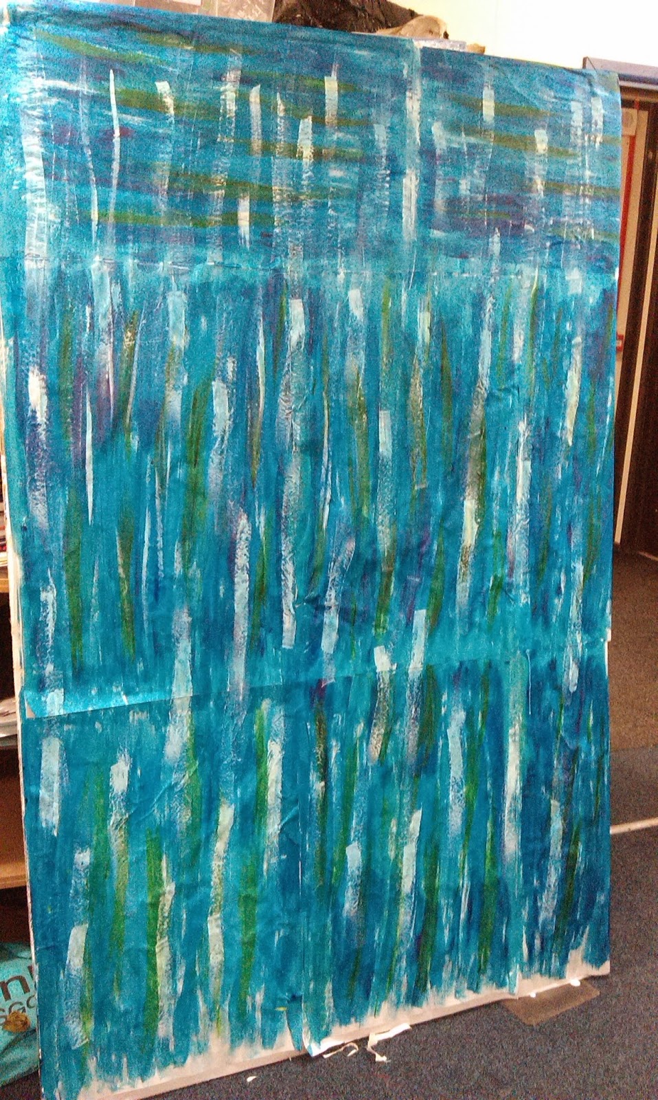
 The board that i used is 2inches thick and is higher 6ft or a low 7ft tall, i didn`t measure it. It originally was used for a student two years ago who made a horror scene about euthanasia. with his permission i took off all of the plaster and ever other material imaginable that was stuck down to this board, which took me three hours to do after school, and then attempt to lift it all the way to my art room which was three rooms down... When the rest of the class got in the next day they were very confused as to why there was an enormous board leaned up against the shelves.

The materials that were used on the board by Dillon (The one who made the horror looking scene), were nearly impossible to take off, the plaster had been left to long that i couldn`t scrape it off with anything. I had to use a base layer of thin chip paper, i layered it up and it eventually it made the bumps seem like they`ve evened out... I think i only used three layers of A1 sized chip paper but it still evened out a little.

After the first chip paper layer had dried, i added a fourth layer... Waiting for things to dry when you know what you are exactly going to do next can be the most frustrating thing; but if you work on top of chip paper when it`s wet it`ll rip easily, so it`s best to just leave it and get on with something else. Once it was dry, i used blue and green Batik Ink. I didn`t water them down or anything; i just poured it straight on and spread it onto the paper with a normal paint brush; Whilst it was still wet i added the odd bits of green so it didn`t seem plain and it seemed more water like.

Bleach is my best friend, for everything i`ve done in my sketchbook and even the paper i write on has been inked and bleached. The yellow bits that you can see in random places is actually some strong bleach, however; you can get different shades and different colours by adding different amounts of water to the bleach. For instance, if you use bleach on top of the ink from a fineliner or black Batik ink; it turns it Orange.

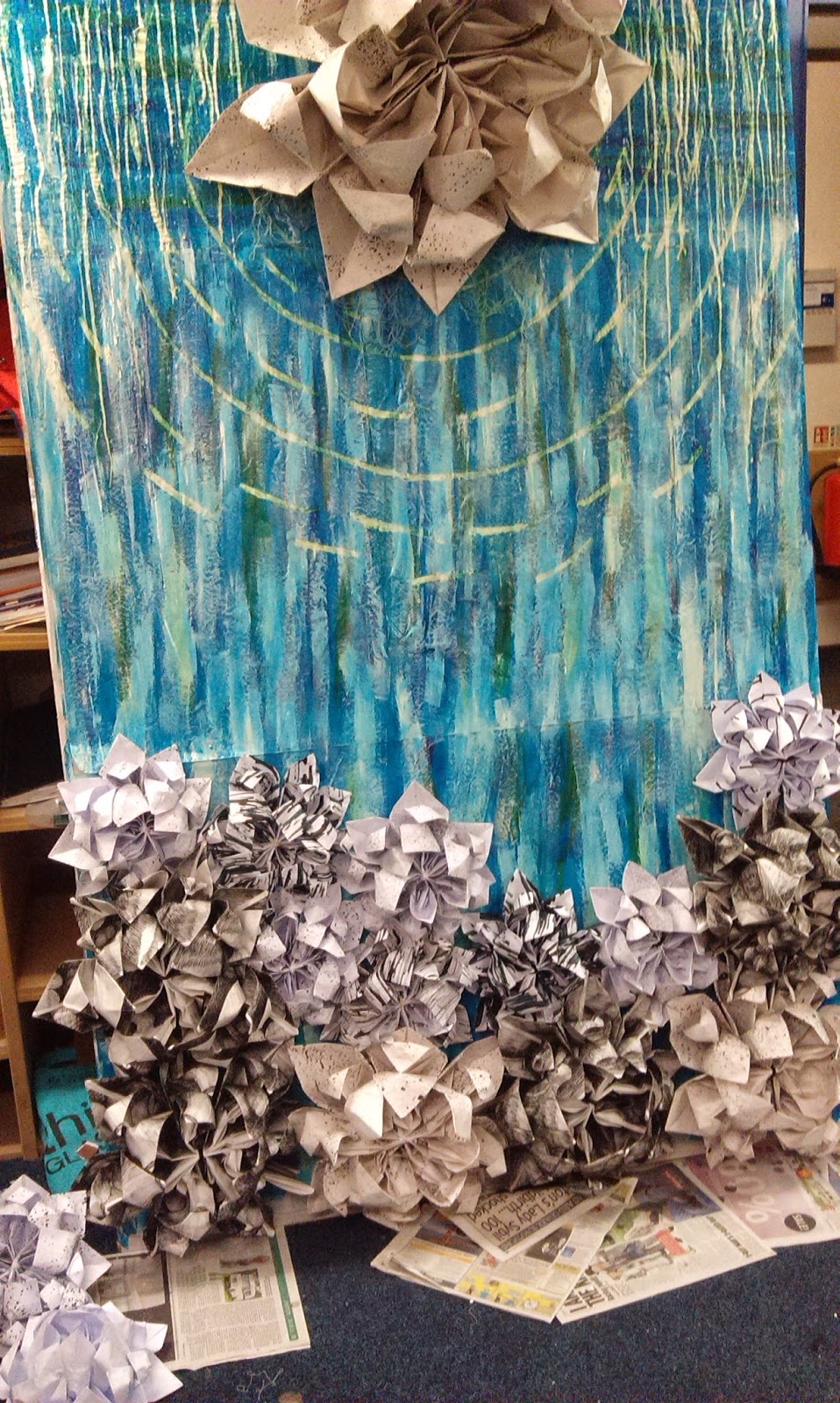
Since i`m only 5.1ft tall, working from the top of the board was difficult for me. I had to stand on a table and put all of my materials on the top. The first layer i used was bleach, i simply just dripped it down from the top of the board and let it run down. On top of the bleach i used hot wax; at school we have White wax pots that heat up wax and eventually it`s just a pot of what looks like water... The only difference is that it`s boiling, when it dries it`s just a big lump, it adds texture to work and it hurts like hell if it touches your skin. Dripping it down means it`s adding bulk, it also runs down the board quite far.

Before i dripped anything else down the board i used white emulsion and dry brushed in certain places to knock the colour back a little bit. after i knocked it back some more i began adding the flowers around the bottom of the board. obviously normal glue won`t work, so i used a basic hot glue gun and a lot of glue sticks...

If you want to learn how to make Origami flowers... Then do it the same way i did; YOUTUBE!!! I looked at youtube tutorials on how to make Origami flowers about 2 years ago and i still know how to make them, surprisingly. Every flower needs 12 sheets of paper, once you`ve made one you can make them again and again, it`s seriously easy to do and they look cute. You can make them any size and out of anything.

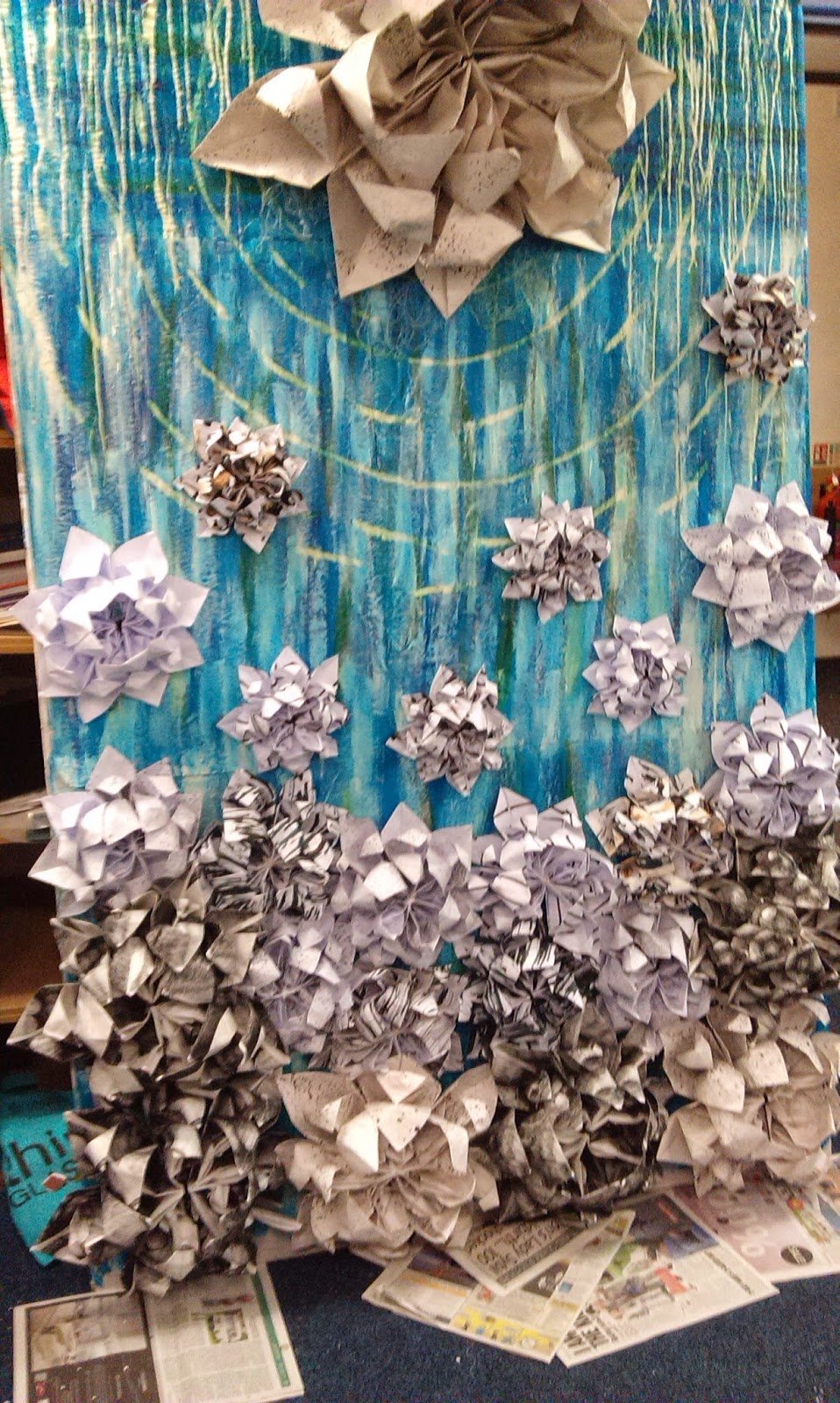
This is an image of the final board when it was first taken into the gallery for exhibition and for the final examination. I`ve added even more smaller flowers to the board, if the smallest ones were an actual size; it would be A7.
I`ve added more materials to drip from the top of the board aswell. I`ve used a lot of plaster to add texture, i added white paint to make sure it came out the right colour. i`ve also dripped wallpaper paste mixed with white paint.
When i added more materials to drip down from the top of board; i had to stand on a table and stretch up to do it, you have to be really careful when dripping the plaster, make sure you don`t get any on your clothes... It doesn`t come out easily. I also dripped little bits of the plaster in different places of the board so the plaster at the top didn`t see so blocky and so it didn`t stick out that much.


 Hearing everyones comments about how good my work is and how much they loved it really boosted my confidence an has actually made me pretty proud of myself! It`s made me think about the next project and the amount of effort i`m going to put in to it...


Everyone loved my work and overall the exhibition turned out great! i`m proud of my work and how it turned out in the end. I`m glad this project is over though, i want to see something new instead of this giant board in our Art room...

~Thanks For Reading!

Monday 2 February 2015

Paper Based Pattern Work.

before all of my CAD, computer work, i used paper based methods to produce different surface pattern outcomes. They were really simple and easy to make, i managed to get them done quite quickly compared to others, yet i took a lot of time and had a lot of patience to produce them all in time for the deadline. 

This image is actually of my Final Pattern Repeat Piece.

Pattern repeating for my was very easy. with some tracing paper and an image to take something from you can create random but funky looking designs out of simple materials. The patterns that you`ll see in this post are all taken from my observational drawings and other images that have been taken from observation. 

The simplest way to produce a pattern repeat piece (paper based); is too use tracing paper and do a basic outline of an area you want to repeat or an area that seems busy and interesting. Once you`ve traced that area on top of some tracing paper; either use a light box or a window to lean on, simply follow the outline with a pencil or fineliner. Then repeat the ever so simple process into a pattern repeat that you prefer; if you`re not sure on what kind of repeats to do, then just use Google and have a look at some different types and process. 

For this repeat that i`m using for my Final Piece i took the pattern from my observational drawing (same with all of them). I only used the basic outline of the piece of image i used, i couldn`t find any interesting detail in the image anyway. The image itself is made up of fineliner and bleach. The orange colour that you can see on top of the small scratchy looking marks, is diluted bleach that i`ve applied with a paintbrush; it`s a very thin layer, that`s what adds the subtle orange colour. The blue dots is some slightly stronger bleach that i`ve simply dropped on to the image, i originally dropped it by accident; but i thought the blue colour was a good contrast in colour with the Orange. 


 These two images are quite simple to put together; even though the colours look strange in contrast with the final piece i made, it`s still done in a simple way.

The main background colours for these two pieces are just made out of drawing inks. For this first one i watered down the colours so they became very pastelly  and the second one just had some black drawing ink added to it to make the colours a bit darker when compared to the first one.

the lighter colours and patterns that you can see on top of both of the images has been added using diluted bleach again. By watering bleach down quite a bit you can add simple but effective looking effects to any image. With these Pattern Pieces i simply added some small mark making details to expand the pattern on them as the design itself was simple and needed a bit more added to it.

For the outline of the first image i used a fineliner just to make the edges seem a bit more redefined and bolder so the colours wouldn`t blend in to the rest of the image. For the second one i used the fineliner to add mark making on top of the bleach used to darken the image some more and then i used the fineliner to redefine the edges of the flowers.

The first image is actually of a mirror repeated pattern; these pattern are really easy to do but become repetitive and can get rather boring to draw out when using a large scale piece of paper. As for the second image, it`s actually a drop pattern, you can usually tell that a pattern is a drop pattern as there will be a diagonal line that runs through the piece; the diagonal line should be of the same pattern. The patterns for both of these pieces were taken from my original observational drawings.

These three repeat pattern pieces are all made up of fineliner; even though one is very bold and the other two aren`t as bold... They are still made up out of fineliner through mark making and fine marks that cover the sheets with something new. 


 For pattern repeat work; it`s good to experiment with different materials and different methods in using those materials. You could still use the one same pattern over and over again but use different materials and different methods in applying those methods.

With fineliners and coloured fineliner you can experiment with blocks of colour, different mark making and mixing the colours through mark making. This can add a varied amount of pattern designs too, making the examples you`ve done a lot more interesting to look at... In my opinion, i don`t see the point in just doing one example of one material; i would rather do multiple methods through one material to show a good knowledge of that one material.

I prefer just working with fineliners and bleach; but i tried out paint, plain mark making, drawing ink and layering on top of drawing ink with other materials like the bleach ad fineliners. Combining materials can make interesting patterns and textures on top of your work.

Since i started the paper based pattern work i`ve become quite fond of the designs; the only down side i would say that there is, is the amount of time it takes to draw out designs, especially when they are A2 sized pieces. 

~Thanks For Reading!